
Commercial Space
1
2
3
4
5
6
7
8
9
10
11
12
13
14
15
16
17
18
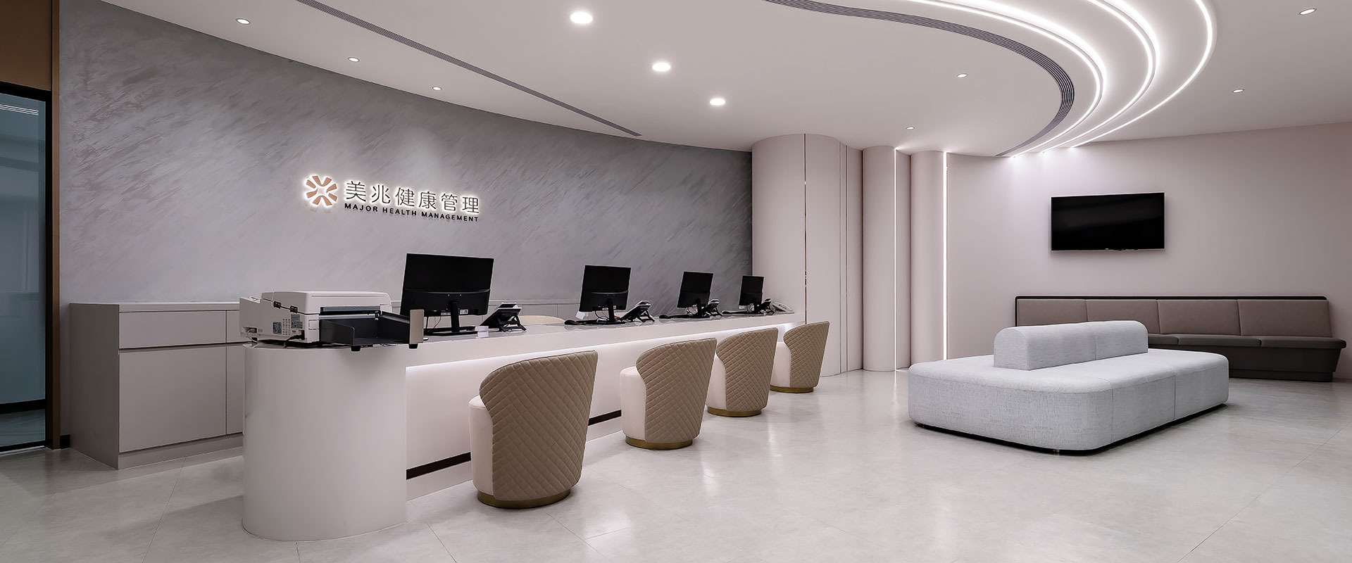
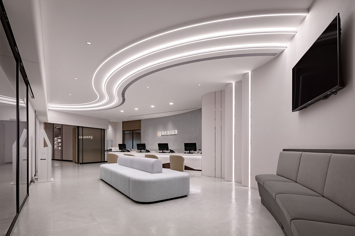
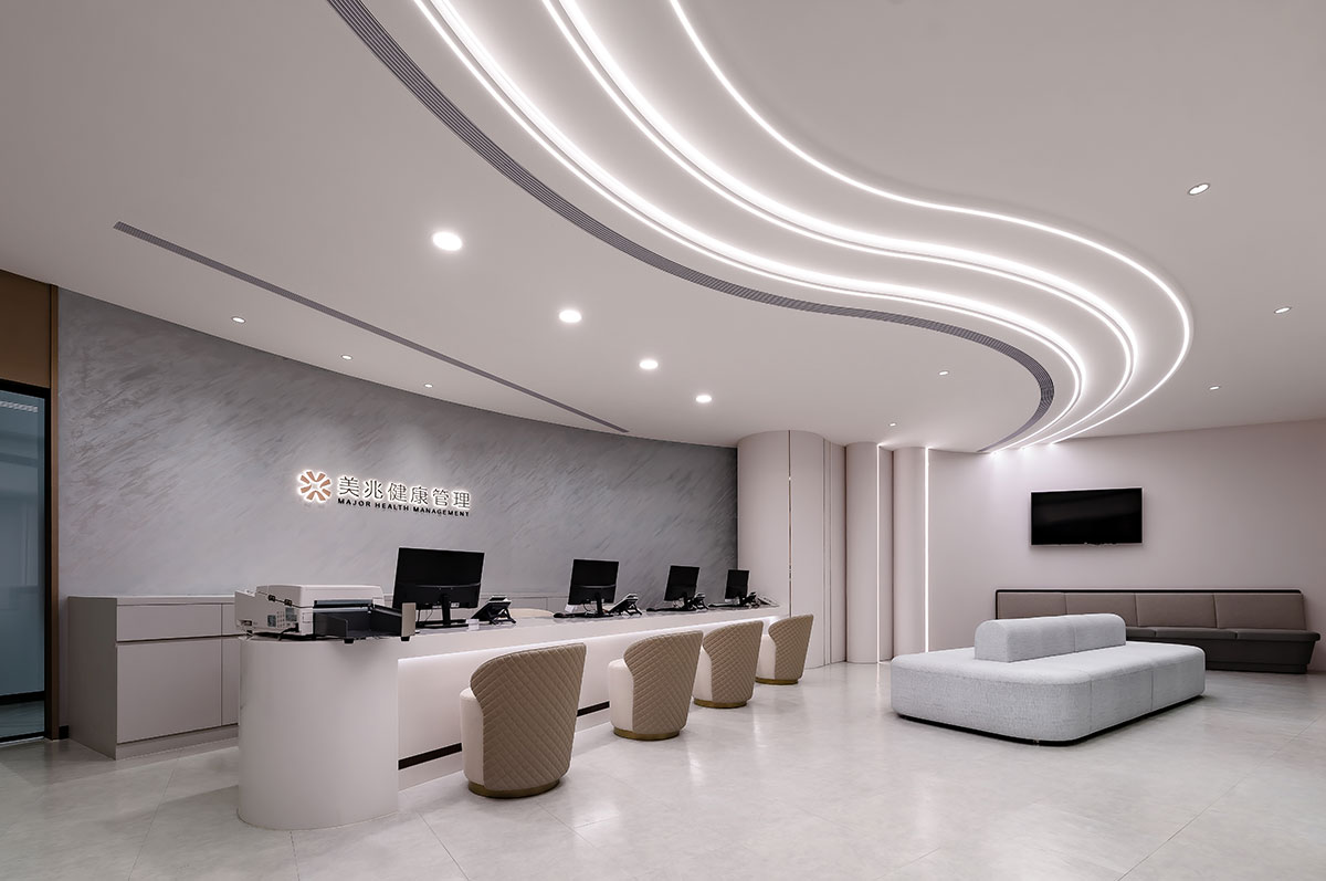
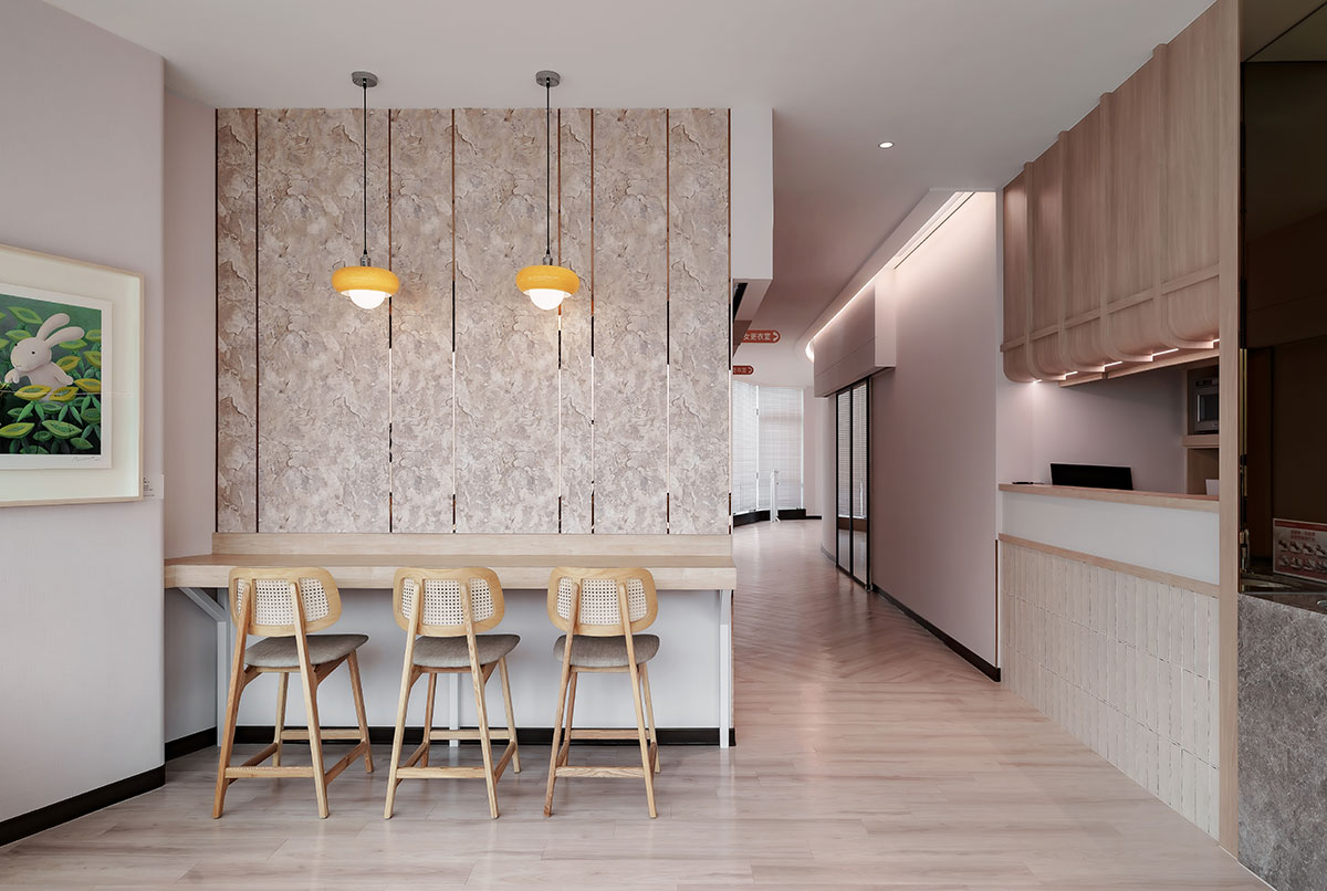
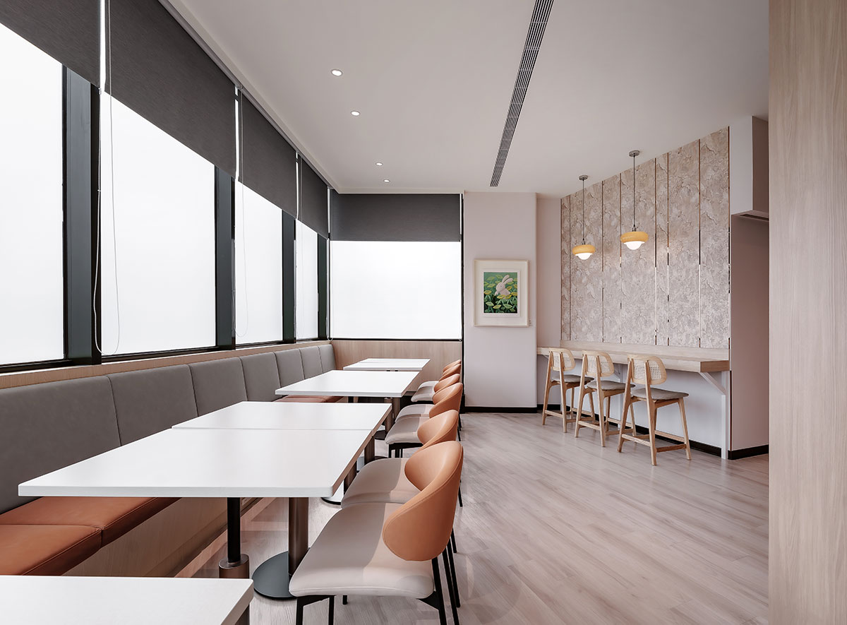
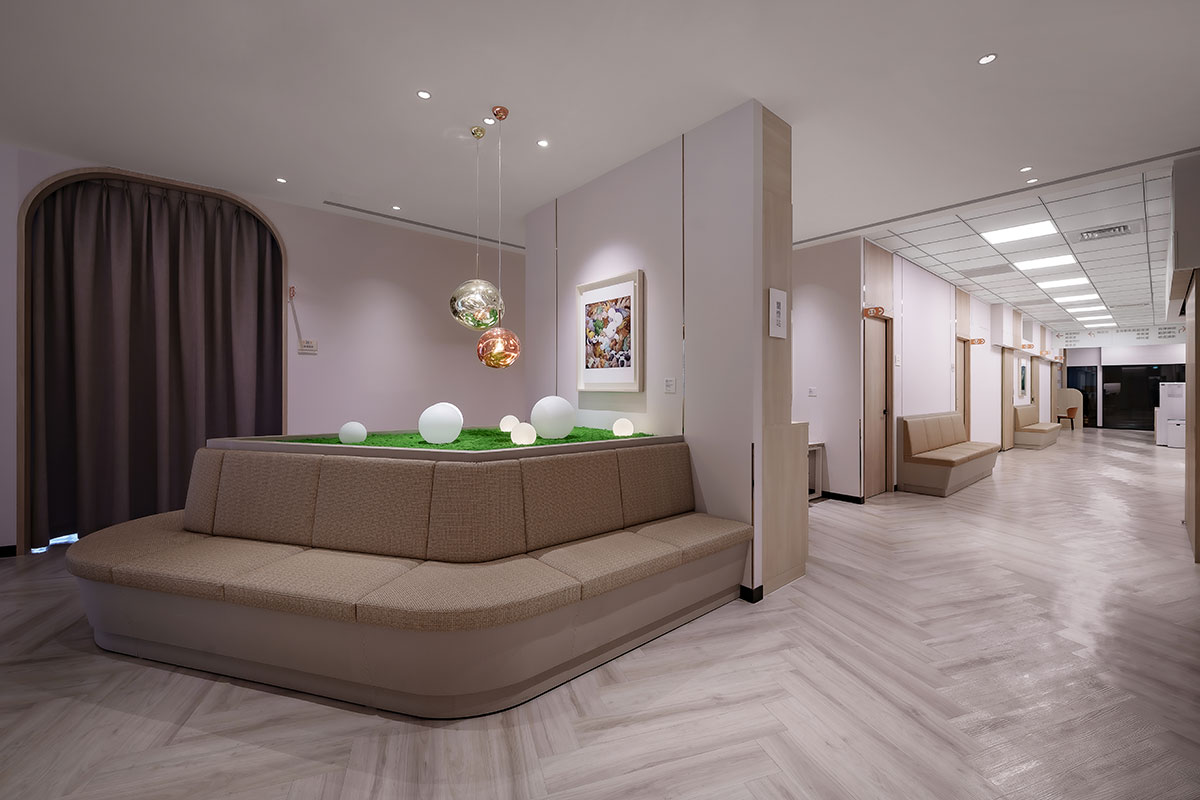
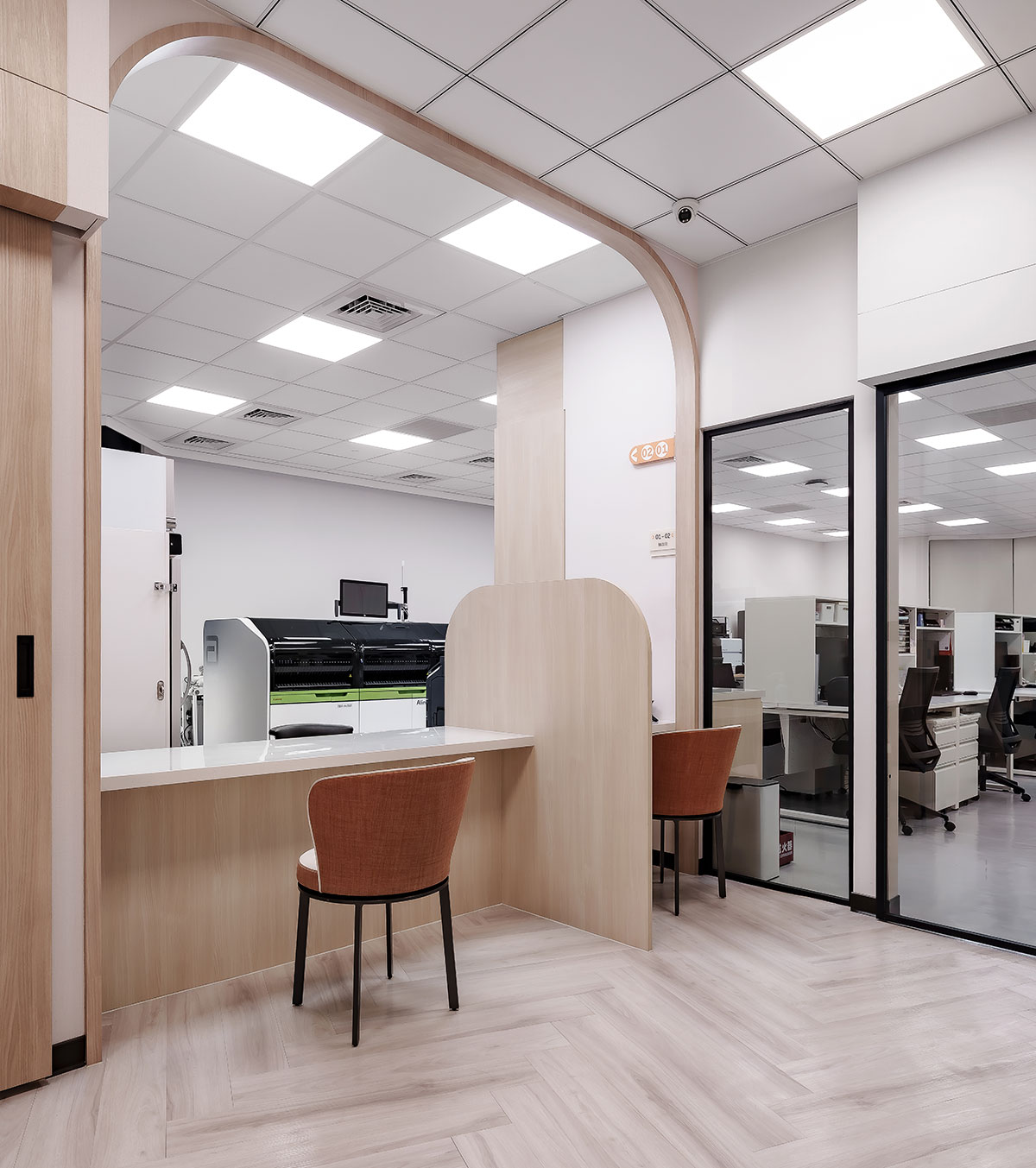
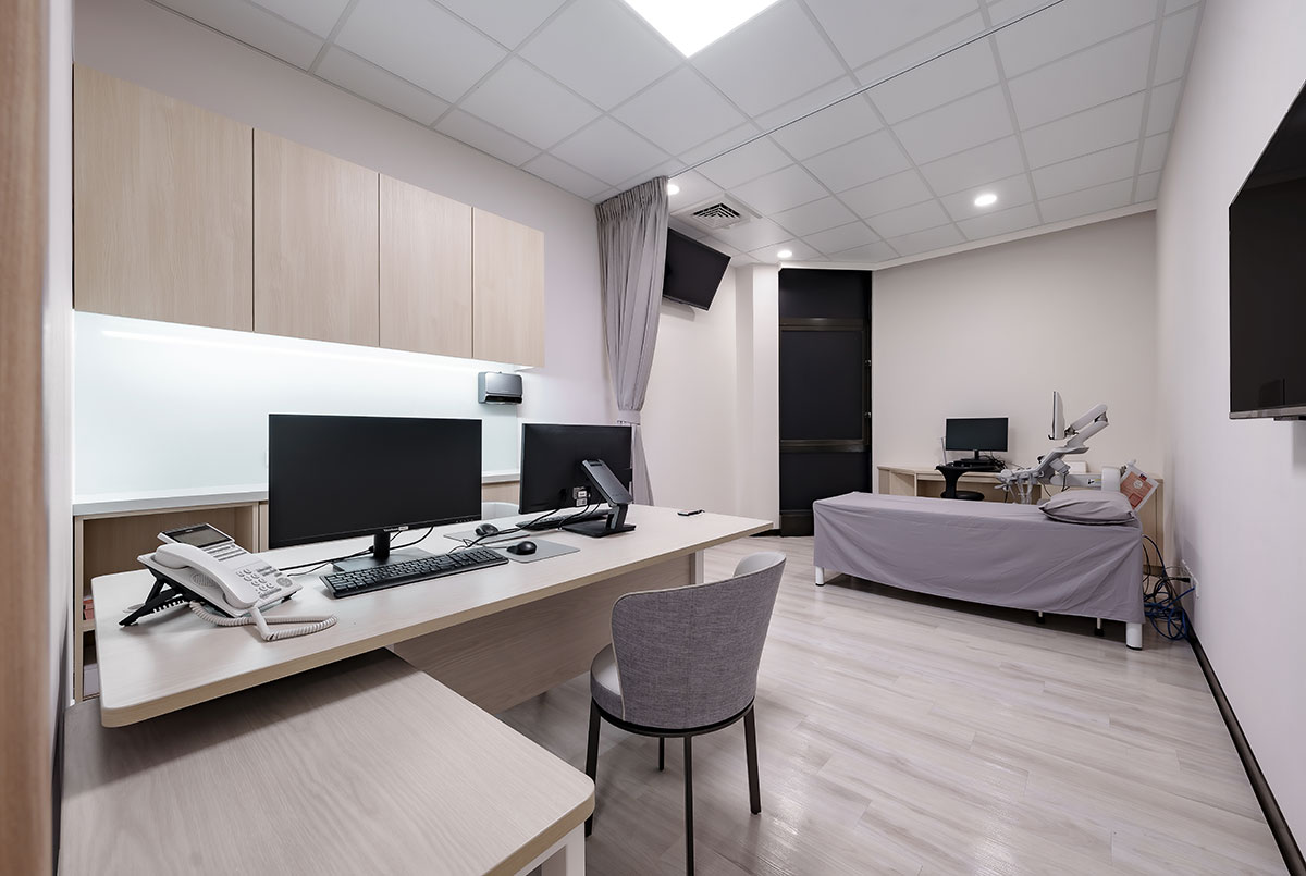
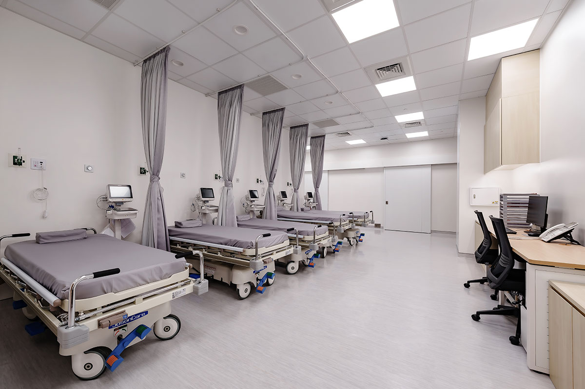
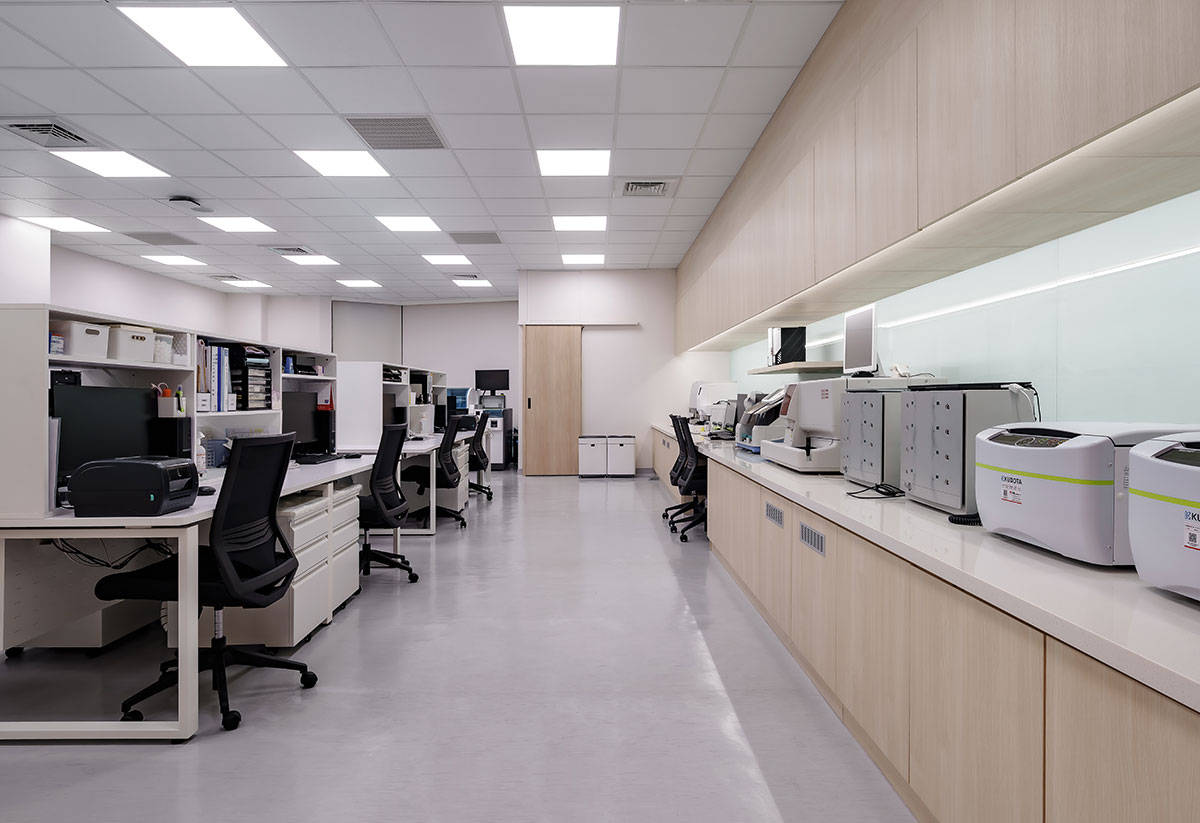
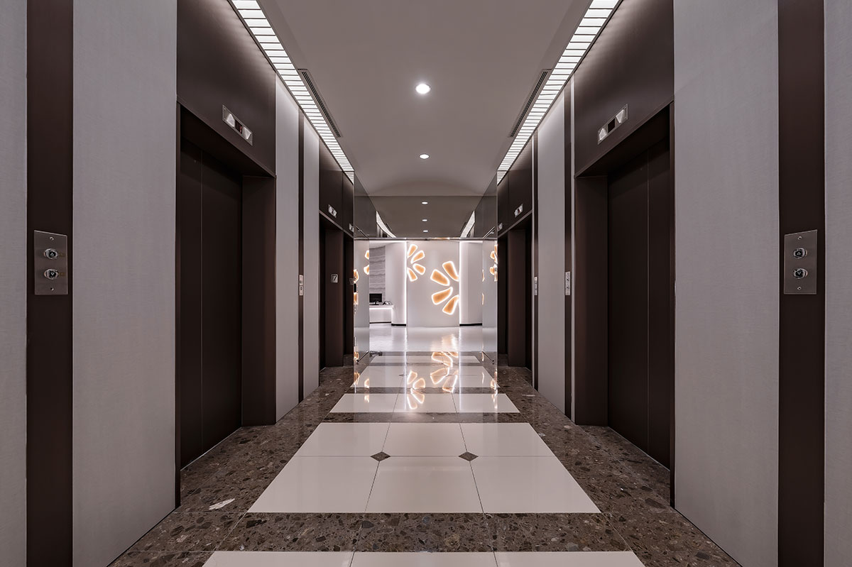
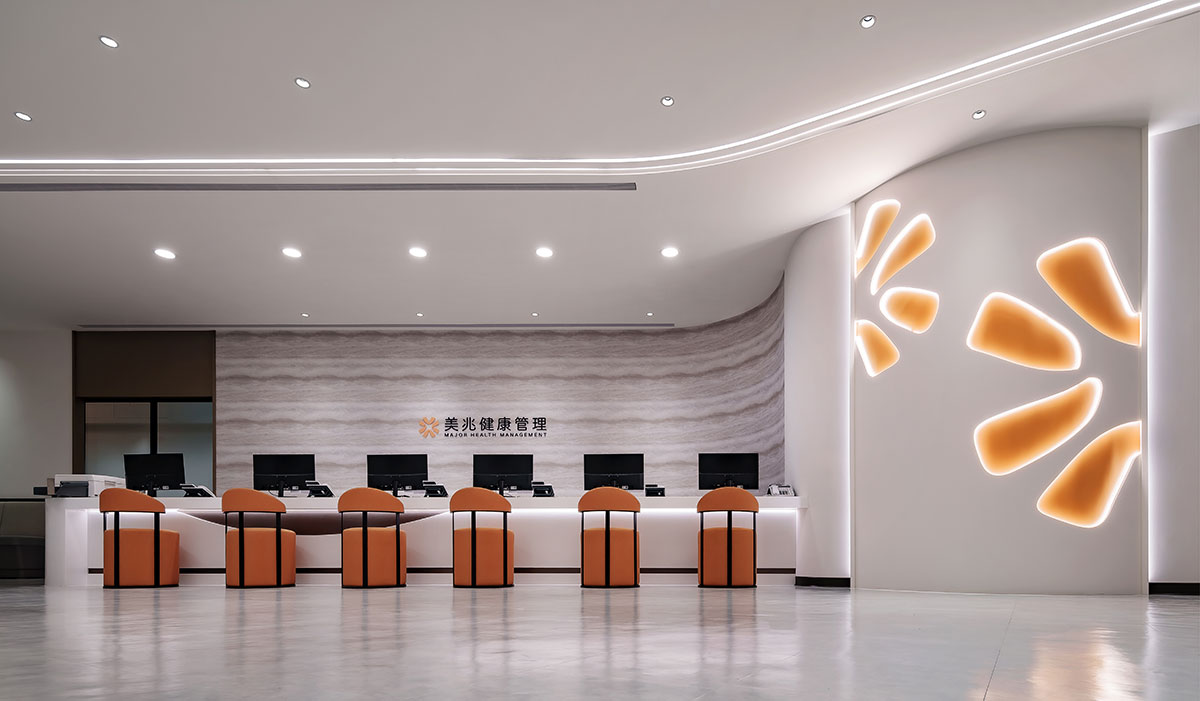
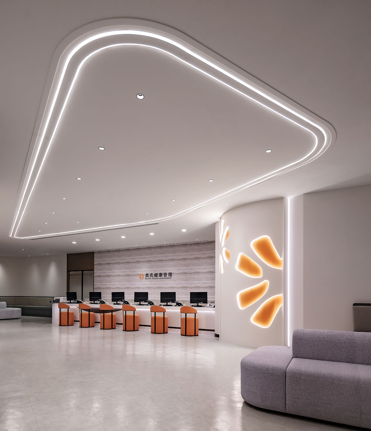
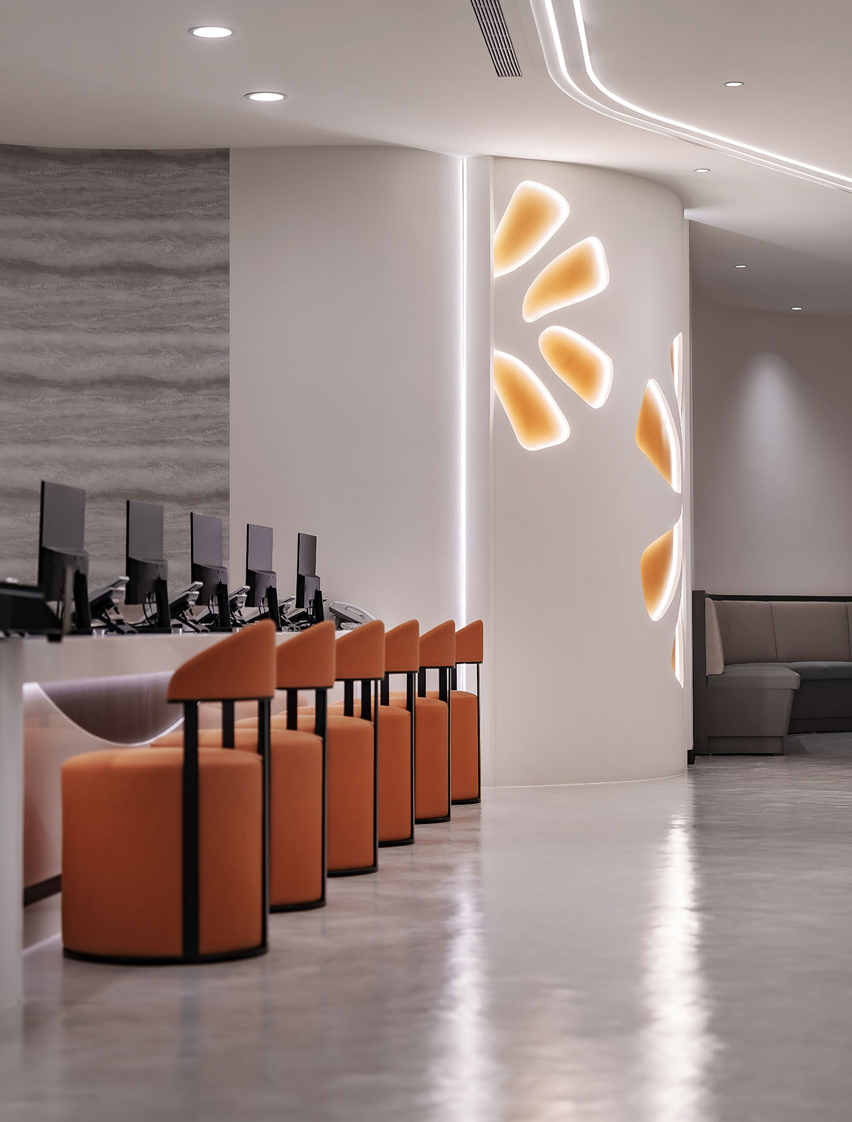
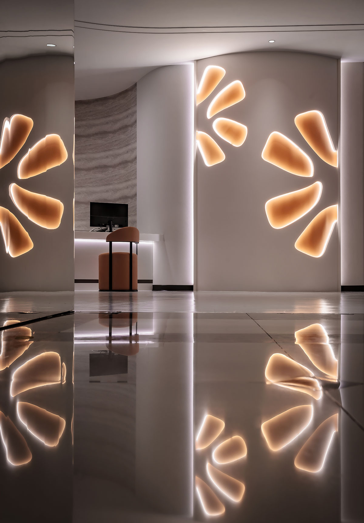
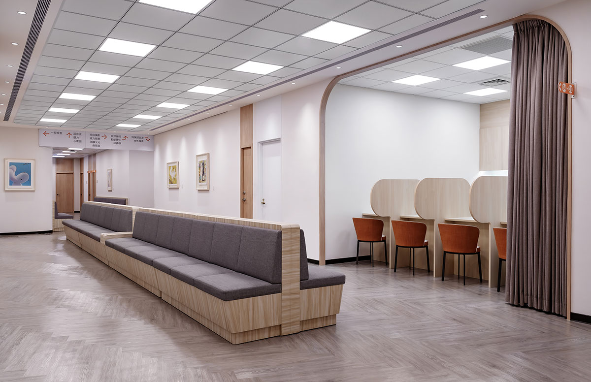
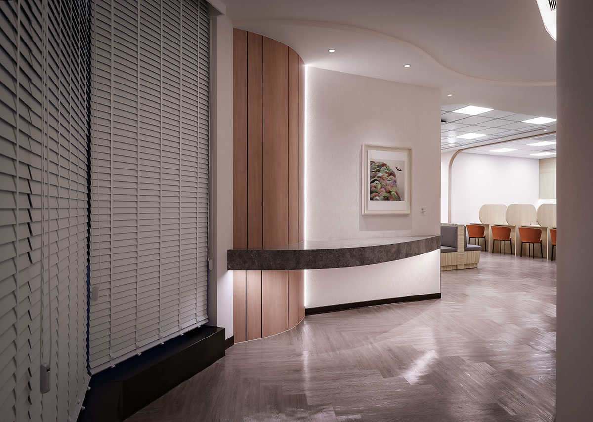
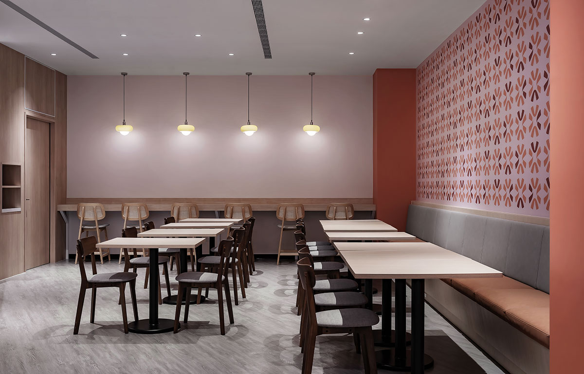
身形弧度本身即為最美的曲線,承載著生命獨有的韻律和溫度。弧線在場域中自然舒展,柔化原本冷硬的氣息;暖調色彩如晨光般瀰漫於各個角落,在視覺、感知之間形成和諧流暢的畫面。踏入其中,人們感受到的不再是被檢視、被量測的緊張,而是一種被溫柔接納的寧靜。
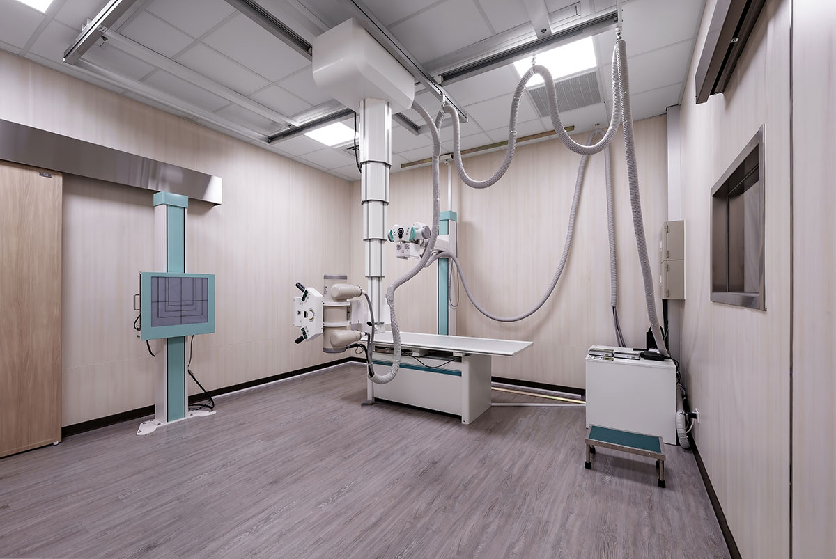
本案為位在西門町核心地帶的健康管理機構,坐擁捷運站周邊的交通優勢,無論自行前來或轉乘皆十分便利,亦有助於提升品牌曝光度。設計團隊善加活用此地利條件,特別將企業識別中的粉橘色調和圓滿的祝福意象,織就成親切的現代氛圍,讓以「人體曲線及皮膚肌理」為主軸的概念發想,進一步使訪客在踏入空間的瞬間便感到放鬆,感受此處所傳遞的專業與關懷。從品牌形象到場所機能,從材料選擇到光線鋪陳,每一項決策背後,都懷抱著同一份心意——讓這裡成為人們願意信賴、放心託付的所在。
The contours of the human body embody the ultimate geometry of grace, carrying a rhythm and warmth unique to life itself. In this space, fluid lines unfold naturally, softening the otherwise stiff, cold clinical atmosphere. A warm palette diffuses through every corner like morning light, creating a visually harmonious, soothing vista. Upon entering, visitors immediately feel an enveloping tranquility that dispels the tension of being scrutinized or measured, replacing anxiety with tender acceptance and care.
As a health management center in the vibrant heart of Ximending, the project leverages its proximity to the metro station to enhance brand visibility and provide exceptional accessibility for clients. The design team maximized this geographic advantage by interweaving the firm's corporate identity—marked by a pastel orange hue—with symbolic motifs of wellness and completeness to create an inviting, contemporary atmosphere. Grounded in a conceptual framework inspired by the human silhouette and skin textures, the design puts visitors at ease the moment they cross the threshold, immediately allowing them to perceive the core values of professionalism and care. From the corporate image to spatial functionality, and from material selection to the orchestration of light, every decision reflects a singular vision to shape an environment where people willingly place their absolute trust.